
Refreshing your home with a new coat of paint is one of the simplest ways to improve its appearance and create a more comfortable living environment. The right paint colours can make a room feel brighter, create a relaxing atmosphere, and complement existing furniture. Whether you prefer a modern, minimalist, or traditional interior, suitable colours can help you achieve a balanced and attractive design.
Trending paint colours for home interiors include warm neutrals, earthy tones, muted greens, soft blues, and deep accent shades. These colours offer flexibility for different rooms, lighting conditions, and interior styles. However, choosing the right shade involves more than following current trends. Homeowners should also consider the room’s purpose, natural lighting, existing furnishings, and personal preferences.
1. Warm Beige and Cream for a Comfortable Interior
Warm beige and cream are popular paint colours for creating a timeless, welcoming interior. These versatile neutrals suit living rooms, bedrooms, dining areas, and open-plan spaces.
They pair well with wooden furniture, cream sofas, woven accessories, and darker accents, making it easy to refresh your furnishings without repainting the walls.
Tips for using warm neutral paint colours:
- Choose light beige to make smaller rooms feel more open.
- Use cream walls to create a bright and comfortable living area.
- Combine beige with white ceilings and natural wood finishes.
- Introduce dark brown or charcoal accessories for contrast.
Before selecting a shade, consider the room’s lighting. A beige colour may appear warmer or darker depending on natural daylight and artificial lighting. Testing a paint sample on the wall can help you determine whether it suits your interior.
2. Muted Green for a Natural and Relaxing Atmosphere
Muted green is a popular choice for creating a natural and relaxing interior. Shades such as sage green, olive green, and eucalyptus green suit bedrooms, living rooms, and reading corners.
Tips for using muted green:
- Choose sage green for a soft, understated look.
- Use olive green to add depth and character.
- Pair green walls with cream, beige, or wooden furniture.
- Select lighter shades for smaller rooms and darker tones for larger spaces.
Consider the room’s natural lighting when choosing a shade. The right muted green can create a balanced, comfortable, and welcoming living space.
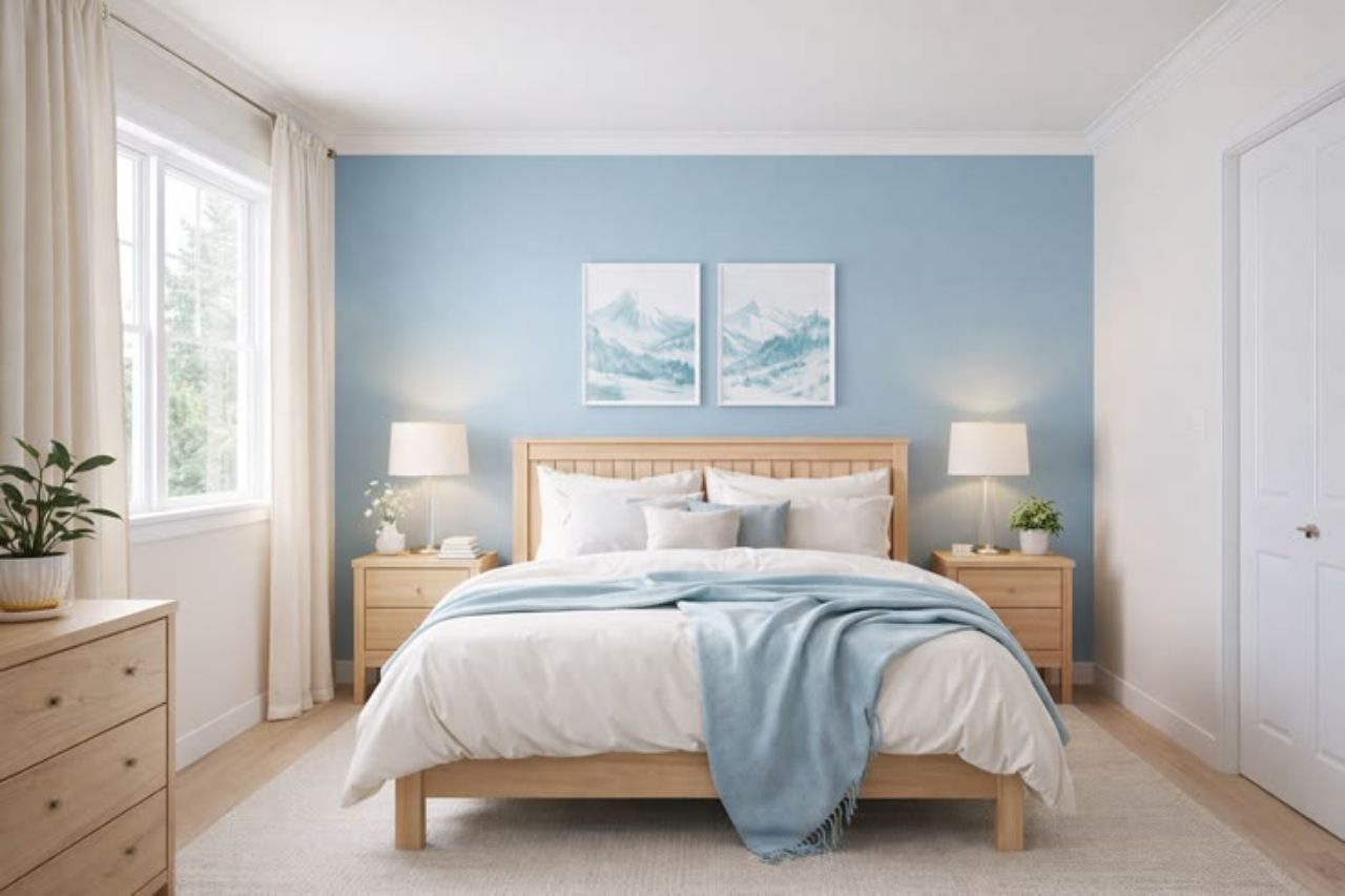
3. Soft Blue for a Fresh and Peaceful Living Space
Soft blue creates a fresh and peaceful atmosphere, making it suitable for bedrooms, study areas, and living rooms. Pale blue keeps spaces feeling airy, while dusty blue and blue-grey add subtle colour and a modern touch.
Tips for using soft blue:
- Pair light blue walls with white ceilings and furnishings.
- Combine blue with beige curtains and wooden furniture for warmth.
- Add cream rugs and warm lighting to create a cosy atmosphere.
- Use white and silver accents for a contemporary look.
Choosing a suitable shade of blue and coordinating it with existing furnishings can create a balanced, comfortable living space.
4. Earthy Terracotta and Clay for Added Character
Terracotta, clay, and muted rust bring warmth and character to home interiors. These earthy paint colours complement Mediterranean, rustic, and contemporary styles, making them suitable for living rooms and dining areas.
For smaller spaces, consider using these shades on a feature wall and pairing them with cream or warm white to maintain a balanced, inviting appearance.
Ideas for incorporating earthy paint colours:
- Paint one wall in muted terracotta to create a focal point.
- Combine clay shades with cream or warm white walls.
- Use wooden furniture and natural fabrics to complement the colour.
- Add dark decorative details for a contemporary appearance.
Before painting, consider how terracotta will look alongside existing flooring, furniture, and curtains. Coordinating these elements can create a more consistent interior design.
5. Greige for a Modern and Versatile Interior
Greige, a blend of grey and beige, offers a modern and versatile option for home interiors. It suits apartments, family homes, and open-plan spaces while complementing wooden flooring, white cabinetry, and neutral furnishings.
Tips for using greige:
- Pair greige walls with cream seating and wooden furniture.
- Add black lighting fixtures for a contemporary look.
- Use consistent shades across connected rooms for a cohesive design.
- Test paint samples to check their undertones against existing furnishings.
Choosing the right greige shade can create a balanced, timeless interior that remains stylish as your home evolves.
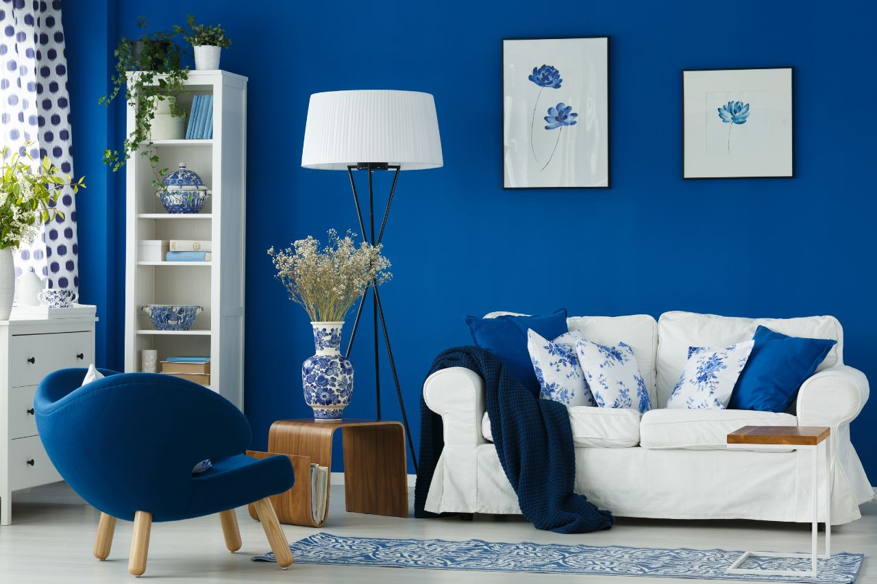
6. Deep Blue and Charcoal for Statement Walls
Deep blue and charcoal add elegance and contrast to modern interiors. They work well as feature wall colours behind sofas, television units, or beds, complementing contemporary furniture and monochromatic designs.
However, darker shades may make rooms feel smaller, so consider the room size, lighting, and existing furnishings before choosing them.
Consider these ideas when using darker shades:
- Use deep blue behind a bed or living room sofa.
- Pair charcoal walls with lighter flooring and furniture.
- Add warm lighting to soften darker surfaces.
- Keep ceilings light to maintain a sense of openness.
Choosing a suitable paint finish is also important. Matte finishes offer a soft appearance, while washable finishes may be more practical for areas that require frequent cleaning.
7. How to Choose the Right Paint Colours for Home Interiors
Although trending colours inspire, the best choice depends on how each shade works within your home. A colour that looks attractive in a photograph may appear different under daylight or artificial lighting.
Before purchasing paint, assess the room and identify the atmosphere you want to create.
Consider these factors:
- Room function: Choose relaxing colours for bedrooms and comfortable shades for living areas. Kitchens and dining rooms may benefit from brighter or warmer tones.
- Natural lighting: Warm neutrals may help rooms with limited daylight feel more inviting, while brighter rooms can accommodate a wider range of colours.
- Room size: Lighter shades can make compact rooms feel more open, while darker colours introduce depth and contrast.
- Existing furnishings: Consider flooring, curtains, cabinets, sofas, and other permanent features.
- Personal preference: Select colours that suit your lifestyle instead of relying entirely on temporary trends.
It is helpful to test paint samples directly on the wall and observe them at different times of the day. This allows you to understand how lighting affects their appearance.
Conclusion
Trending paint colours for home interiors provide many ways to refresh your living space without undertaking a major renovation. Warm beige, cream, muted green, soft blue, terracotta, greige, and deep blue can each create a different atmosphere when selected appropriately.
The key is to balance current design trends with practical considerations such as lighting, room size, furnishings, surface condition, and maintenance requirements. Testing paint samples and choosing a suitable finish can also improve the final results.
By selecting colours that complement your existing interior and reflect your personal preferences, you can create a comfortable, attractive, and lasting living environment.